A user experience case study for my Professional Diploma with The UX Design Institute
BRAND Fly UX
MY ROLE UX designer
THE BRIEF Improve the flight booking process for a new airline’s website called Fly UX. The experience should be fast, easy and intuitive- based on a deep understanding of the target users.

Fly UX Research
RESEARCH BLOCK Research is the first step in my journey, as it’s key to the UX Design process in order to identify the problems needed to be solved for the user.
I studied all the different types of research from qualitative and quantitative to observational and attitudinal, as well as heuristics.
For the projects I conducted in-depth interviews and usability tests, a competitive benchmark review and created an online survey.
RESEARCH TOOLS Adobe InDesign, Survey Monkey, and Loom
USABILITY TESTS
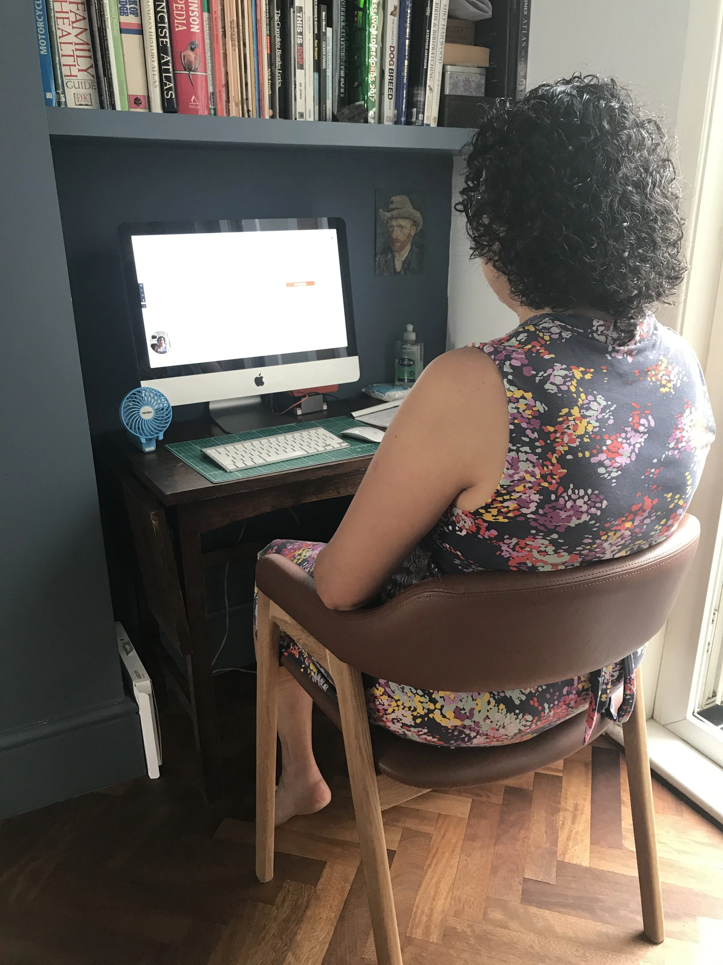
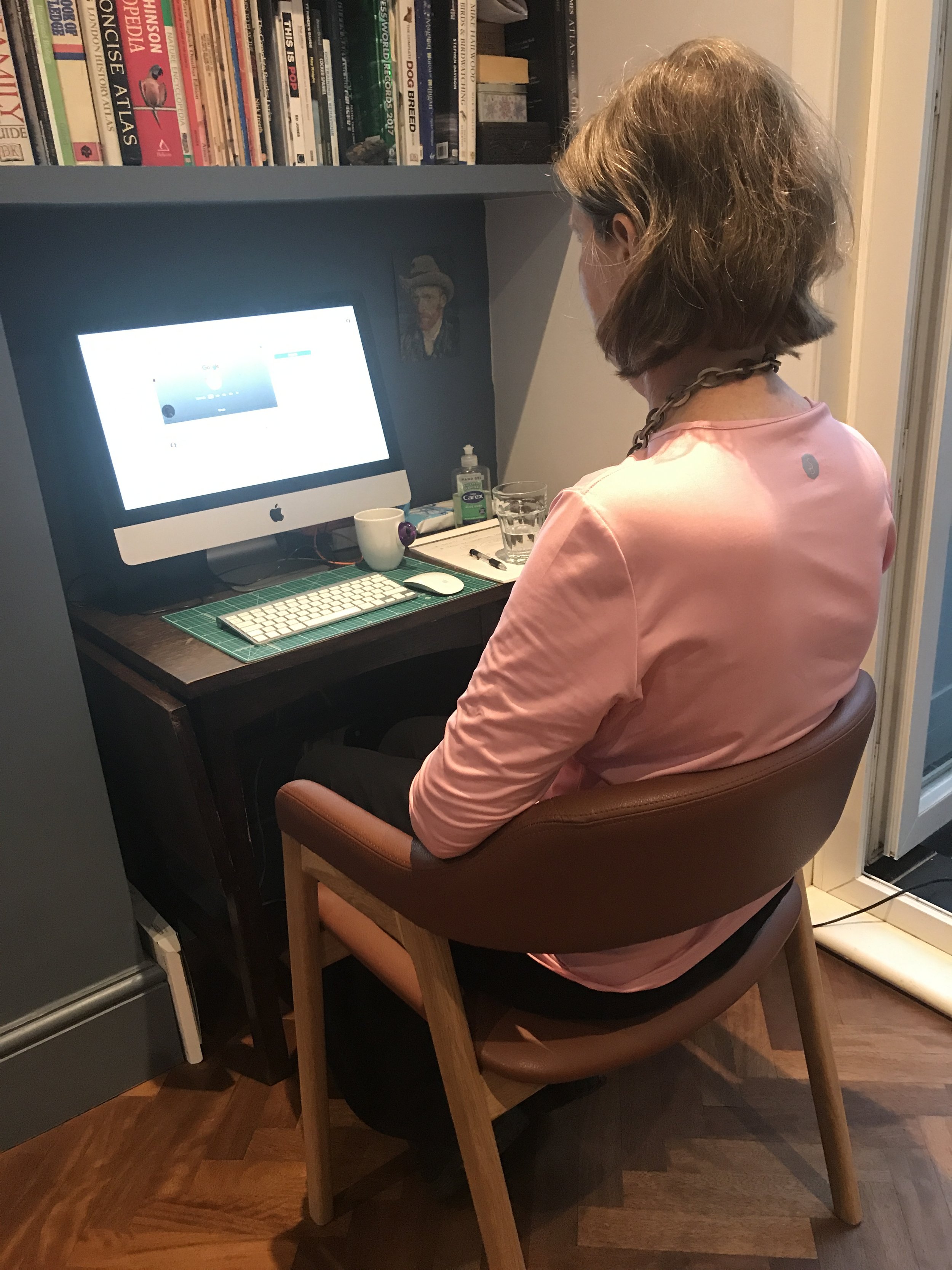
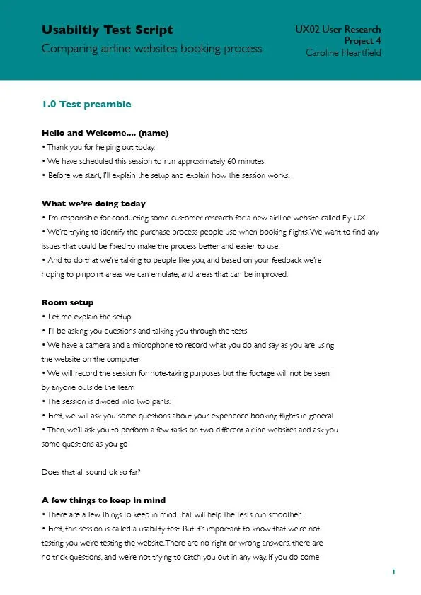
Qualitative usability tests are generally the best method to find out more about users goals, behaviours and pain points. I wrote an in-depth interview script and recruited two airline users. And then set up and ran both usability tests.
Note-taking was also studied and completed to pick out key insights observed, and then I categorised them into Good & Bad user experiences.
I gained some amazing insights from these tests, specifically how everyone does a job differently. One fact remained consistent throughout, and that was the need for simplicity- there were too many obstacles in the way of their main priority, which was to book a flight.
“I am not here for inspiration, I am here to buy flights”
“Oh my gosh, colours. Things. Now that panics me a bit”
COMPETITIVE BENCHMARK
My full competitive review consisted of three World class airline websites and a travel site that did the booking process well- British Airways, Emirates, Qatar, and Mr & Mrs Smith.
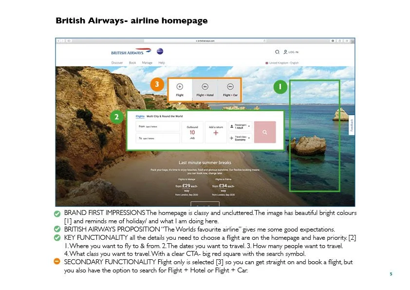
I compared their homepages, the flight search and selection pages, as well as the booking process. To highlight best practices, I used heuristics principles and a colour coded key for: what was done well, what was expected, and pain points.
I learnt what the best conventions were in airline websites, and what the best practice ideas were to emulate for Fly UX. I also discovered first hand what I didn’t want in my website.
A small sample of my Competitive Benchmark document
ONLINE SURVEY
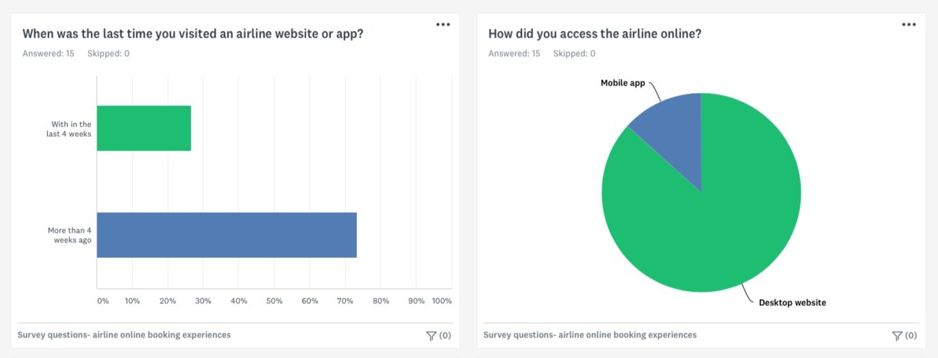
To find out what airline website user goals, booking habits and behaviours were, I created a survey. I developed 10 questions, which took under two minutes to complete.
The survey was created using the online tool Survey Monkey, and I found 15 lead airline bookers via email to take part.
I hadn’t used the online survey method before -but I will in the future- It was quick, easy and very rich in insights.
A sample of my survey questions

Fly UX Analysis
ANALYSIS BLOCK Analysis is key in order to understand the users problem to be solved.
I started by gathering up all the unstructured data I created during the research phase, and analysed it by firstly creating an affinity diagram and then a customer journey map.
Here I studied: user goals and empathy maps; structure and navigation including information architecture; interactions like controls, rules and feedback; and design principles like affordances and perceivability and predictability.
ANALYSIS TOOLS Pen & paper, Adobe InDesign, and Miro
AFFINITY DIAGRAM TEAM Chetna McGuinness
AFFINITY DIAGRAM
First of all I conducted a review of all my research projects and made notes.
Then I did a collab with Chetna (also on the course) to create the diagram in Miro. In a few online sessions, we took all the vast unstructured findings and put them into meaningful groups following the users flow through the booking process. These groups took into account positive as well as pain points for the user. We also included their Goals, Behaviours and Context.
The team aspect of this project was a huge success, I can see why collaborations are so intrinsic to UX to bounce ideas. It’s how I have always worked but in a traditional art director/ copywriter team. This was a fairly long one, but I personally found it incredibly satisfying seeing it all come together like a jigsaw.
CUSTOMER JOURNEY MAP
Using the affinity diagram’s newly structured data with valuable insights and conclusions, I created this journey map to show the process a user went through to book a flight online. I highlighted their goals, behaviours, pain points and positives along the way. I also demonstrated the users experience with relevant quotes to demonstrate the highs and lows of the process.
The organised side of me enjoyed this project, putting all the research into one document that flowed logically through the booking process.

Fly UX Concept
CONCEPT BLOCK Conceptualising is key to solving the problem users face when booking a flight.
In order to this I created a flow diagram and sketched Interaction and navigation designs.
In this block I studied: design patterns like chunking, alignment and inline validation; Mobile websites and native apps; and workflows like registration, on boarding and sign-in.
CONCEPT TOOLS Pen & paper, Adobe InDesign and Figma
FLOW DIAGRAM
I defined a high-level flow which focused on one primary user case. Using all my research and analysis to date and addressing all issues that came up in my Customer Journey Map.
I kept wanting to cover every possible use case, so took some reining in to concentrate on just the one case.
INTERACTION DESIGN
By this point I had done a lot of work articulating the problem, this project started the solution mode. Using the Flow diagram I sketched all the main screen states, incorporating all the learnings from my research to show interactions, rules and feedback. I also used the mantra- Keep it simple, on brand, and intuitive with confidence.
This was probably my favourite project, I loved putting all the design ideas I had onto paper. It was really worth agonising over every single button and word, as this made the final projects much more straight forward for me.
A key selection of sketches that cover the flight booking process

Fly UX Design
DESIGN BLOCK The final stage in this UX journey equipped me with the knowledge on how to design the solution by building an interactive prototype, as well how to annotate wireframes to create a handover document.
Here I studied: the difference in low, medium and high fidelity prototypes and how to create them; wireframing from sketch to computer and making a handover document.
DESIGN TOOLS Adobe XD & InDesign
Wireframes with annotated notes
Using the static pages from the medium-fidelity prototype, I created a document that defined all the extra details that developers would require to build the Fly UX website to my design. Making sure to explain Controls, Rules and Feedback.
This project gave me the confidence to know I can prepare a thorough hand over document to the build team.
A key selection of my wireframes with annotated notes
MY FLY UX PROTOTYPE
Taking everything I have learnt about User Experience, from research and analysis to concept and design, I created my own interactive medium-fidelity prototype. Every single thing in this prototype has been designed from user insights, like the decision not to put class on the search box, to avoid repetition later on. Or, putting the customers initials on the seating plan for clarity. Or, putting age text hints when selecting the passengers.
I took into consideration every single click, to make this a simple, quick and intuitive experience. And I am very proud of the results.


