A user interface case study for a Diploma with The UX Design Institute
BRAND Bank UI
MY ROLE UI designer
THE BRIEF Create a fresh, intuitive interface for a new responsive banking application to help them stand out. Design mobile, desktop and tablet screens for three stages of the process. The brand tone is Playful, Clear & Trustworthy.
TOOL Figma
Bank UI Brand & Personality
BRAND TONE RESEARCH
Firstly I researched the competitors and created mood boards to represent the three aspects of the brand tone: Playful, Clear & Trustworthy.
While all 3x brand tones had equal weight in my final designs, personally I found the clear mood board gave me most clarity for how I wanted to move forward... I liked the use of white space with small burst of viabrant colours.
BRANDING ELEMENTS- NAME, LOGO, ICONS & CARDS
I called my bank, bank. Keeping it simple & clear.
And made a logo symbol out of a stack of coins, which is hopefully playful. While the logo symbol is always in a solid colour, I used a gentile gradient of the primary colour when used behind it.
I also made up some different account cards to be used in my design, using a new vibrant accent colour for each product.
I had hoped that creating a logo with small burst of vibrant colours, would provide me with different colours for different bank accounts within the application- but this proved complicated and created extra work for me to get the final designs right, and not be overcrowded.
Bank UI Design Process
GRIDS
I set up an 8pt grid system across all screen sizes. Then I looked at columns, gutters and margins:
Desktop- 12 Column, 24 Gutter, 80 Margin
Tablet- 8 Column, 16 Gutter, 40 Margin
Mobile- 4 Column, 8 Gutter, 16 Margin
I had to make some minor tweaks to my original grid system as the design process developed. And I found post-it notes with the 8 times table on my screen really helpful throughout the design process!
DESIGN ITERATIONS
My designs evolved over time. I started off using too much colour, the screens didn’t fit into my idea of using lots of white space with bursts of accent colours. And as this was a responsive brief, each screen design had to work across the mobile, tablet and desktop.
COLOUR
Personally I feel blue is overused in the banking world, so I chose a teal green which is fresh but also trustworthy and solid. This was the primary colour which was dominant throughout for consistancy to gain trust.
Then I started to think about secondary accent colours, I wanted to introduce a whole set for small bursts of vibrant colour. These all had to be carefully screened for contrast, so even the colour blind could differentiate.
I didn’t realise that as many as 1 in 12 men are colour blind, putting extreme importance on contrast and colour combination choice, which is a huge accessibility issue.
TYPOGRAPHY
I was drawn to Nunito for the headlines and subheadings. It’s sans serif, clear/modern and trustworthy/honest, with a hint of rounded fun. It is also very flexible working in CAPS and lowercase, and comes in extra light, light, regular, semi bold, bold, extra bold and black.
And for the body copy I wanted to look at pairing Nunito with Roboto, as I think they work well together. And it works incredibly well small. This is a financial site afterall, that will at times be very text heavy- simplicity is key.
Nunito & Roboto tick all the boxes- Legibility, Readablitly, Modesty, Flexiblity & they are both an Open Source.
Typegraphy and typographic hierarchy & spacing is almost certainly the most exciting part of any project for me. I learned that choosing fonts, and combination of fonts is important not just for legibility, but for brand perception, and ease of use.
INTERACTIONS & COMPONENTS
Buttons, icons, drop-downs, search bars, forms, navigation bars… anything that is interactive was designed and made to fit into my bank brand- clean & clear, consistant & trustworthy, colourful & fun.
Affordances were important here, so I used a subtle shadow so clickable items appeared like buttons.
Icons and graphics are chunky and rounded to appear clear & fun. And the teal green is the consistent dominant colour, for trustworthiness.
These interactions, components and icons probably took up a highest proportion of my time. I found it incredibly important to get a constant line weight across the designs. And there were many versions of each that needed to be considered.
Bank UI Final screens
MOBILE FINAL SCREEN DESIGNS
iPAD FINAL SCREEN DESIGNS
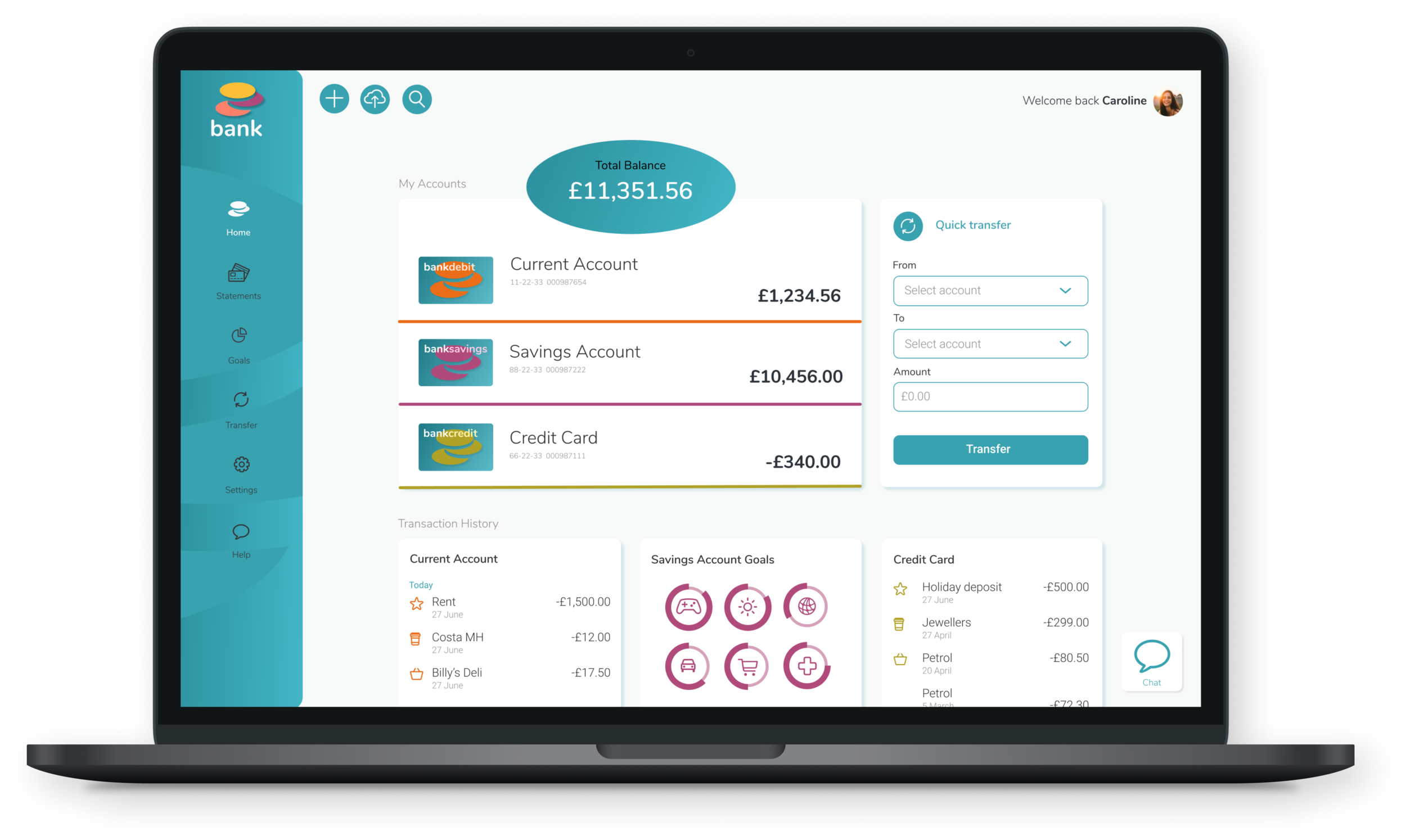
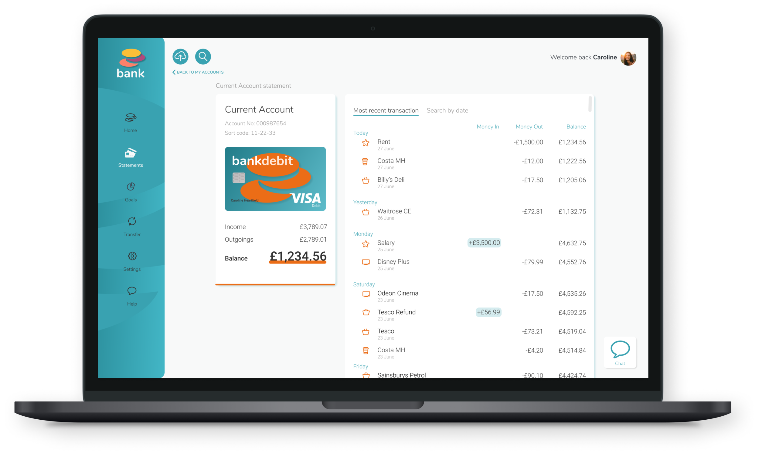
DESKTOP FINAL SCREEN DESIGNS
“The page is simple (which) really helps with the clarity of it... and your information is very well conveyed to the user”
Emily Jacquier- Student Success Team at the UX Design Institute
Bank websites naturally have a lot of information content, which is why the Clear brand tone was imperative to me.
Clear- Clarity and intutitve designs were at the fore of my design decisions. As were nailing the hierarchy of message, so the user always knew what they were doing, and where they were going next.
Trustworthy- The consistent use of my primary teal and the choice of typefaces both worked towards a brand that could be trusted, which is such an important attribute for a bank.
Fun- The viabrant burst of colour added my fun element, as did the coin the logo symbol. And while the typeface was legible and on brand for a bank, it has a fun edge with such rounded curves.
On reflection, I was happy my the clean design. More specifically the use of white space and small bursts of bright colours. I also like the teal green for difference from ‘banking blue’. I’m really happy with the coin logo symbol I created to work for the branding using the closure principle (though this could have been developed even further for icons or bullet points etc?). The Current Account statement page is my favourite of the three, for clarity of typography. And the mobile is my favourite devise design out of the three.
I struggled with content for the third My Spending screen. I wanted to make it about Savings goals and the two clashed. But after alot of hard work, and asking mentors and users for direction, I think I came to a compromise. This was also one of the first time using the Figma tool, there was lots to learn, which limited some of my design decisions. But I felt by the end (with the add of many YouTube videos) I had a good grasp of it.
What would I do differently next time? Firstly, I would sign up to a few banking apps for more thorough research. And, I would definitely like to have looked at some animations of the interactions. Like how the search button opens up on selection. Or simply how it looks to go from one screen to another. Making a prototype and conducting a usablity test would be great also, so I could take another look at what actually works with the user.


